Designing a poster is never just about arranging colors, fonts, and images—it’s about telling a story. For the Kyrie Fitness Gym Year-End Party, that story was a celebration of energy, community, and growth. The challenge wasn’t just to make it visually appealing but to capture the unique blend of what the event stood for: the grit and strength of a fitness brand mixed with the nonchalant vibe of a beach party.
This project wasn’t your average gym promotion. It needed to do more than advertise an event; it had to excite, inspire, and invite people to be part of something special. From bold typography to textured backgrounds and vibrant accents, every design choice had to work together to create a visual that felt both powerful and fun.
What followed was a creative process that tested my ability to balance themes, merge aesthetics, and communicate effectively. It was a design journey filled with experimentation, collaboration, and lessons learned. In this post, I’ll take you behind the scenes, showing how this poster evolved from concept to completion, blending creativity with strategy to bring a vision to life.
Understanding the Client’s Vision
A successful design starts with a clear understanding of the client’s vision. For the Kyrie Fitness Gym Year-End Party poster, the goal was to craft a visual that captured the energy and essence of the event.
From the start, the project had two primary objectives: to grab attention and communicate essential details effectively. Kyrie Fitness Gym wanted a design that reflected their core values—strength, discipline, and unity—while also feeling inviting and fun. It had to excite their core audience of gym-goers but remain approachable enough to attract a wider range of attendees.
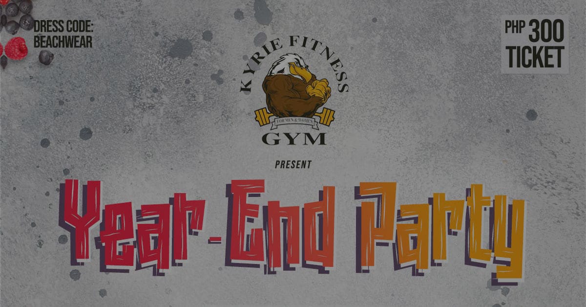
The client’s requirements were clear: the gym’s eagle logo needed to take center stage, anchoring the design in the brand’s identity. The theme had to blend two distinct ideas—fitness and festivity—without leaning too heavily into either. Additionally, the layout needed to accommodate critical details like the event’s date, location, dress code, and sponsors while maintaining a clean and engaging look.
The Creative Process
The creative process for the Kyrie Fitness Gym Year-End Party poster was an exciting journey of blending bold branding with a festive vibe. It required a mix of inspiration, experimentation, and refinement to create a design that stood out while staying true to the gym’s identity.
Finding Inspiration
The first step was gathering ideas. Kyrie Fitness Gym’s eagle logo symbolized strength and focus, which became the foundation of the design. From there, I drew inspiration from tropical themes to capture the beach party atmosphere. Vibrant colors like reds, oranges, and yellows reflected energy and excitement, while softer accents like blues and sandy tones brought a sense of fun and relaxation.

I also looked at textures commonly associated with gym culture—gritty concrete, bold typography, and sharp contrasts—and merged them with playful elements like layered fonts and curved lines to soften the overall feel.
Once I had a clear vision, I started experimenting with layouts. Initial sketches helped me organize key elements: the event title, eagle logo, event details, and sponsor logos. This phase was about trial and error—finding a way to give each element prominence without cluttering the design. Hierarchy played a critical role, ensuring the viewer’s eye naturally flowed from the bold “Year-End Party” title to the supporting details.
Color was another focus during this phase. I tested different combinations to find a palette that was dynamic yet cohesive. The textured background added depth, mimicking the raw aesthetic of gym walls while keeping the design visually interesting.
Overcoming Challenges
Balancing the dual themes of fitness and festivity was a challenge. Too much focus on the gym’s branding risked making the poster feel too serious, while leaning too heavily into the beach theme could dilute the brand’s identity. I tackled this by carefully layering elements—using bold, blocky fonts to emphasize strength and vibrant, flowing accents to highlight the celebratory aspect.
Adapting the design for multiple formats was another hurdle. The poster had to work both as a large print and a smaller digital graphic. Testing various sizes and tweaking details, like font weights and spacing, ensured readability across all platforms.
Refinements
The final stages were about refining the design. Collaborating with Kyrie Fitness Gym, I made adjustments based on their feedback—tweaking sponsor placements, adjusting the typography, and enhancing visual balance. This iterative process ensured the poster was polished, effective, and ready to inspire excitement for the event.
Breaking Down the Final Design
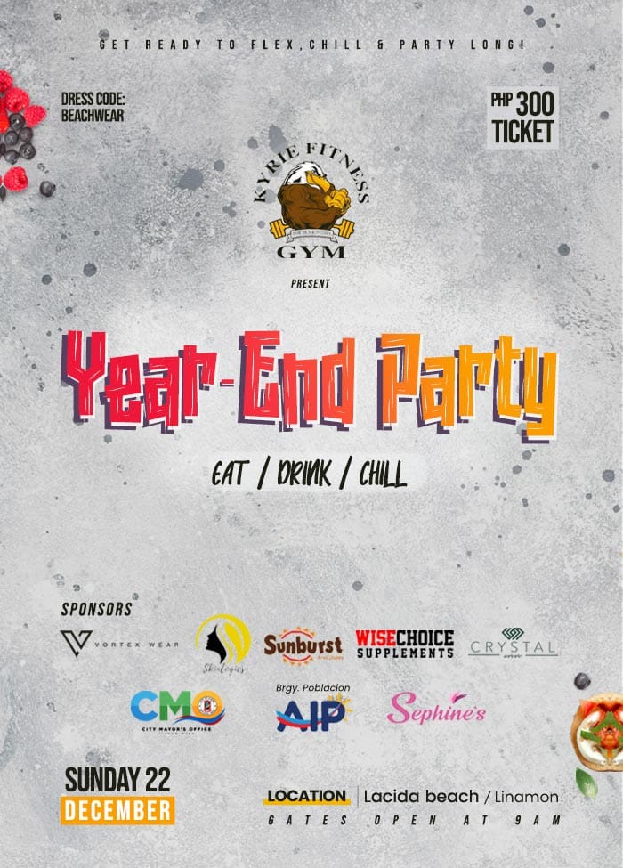
The final design for the Kyrie Fitness Gym Year-End Party poster was a blend of bold branding, vibrant energy, and clear communication. Every element played a role in ensuring the poster not only caught attention but also conveyed the event’s details in a way that was easy to understand and engaging.
The Main Components
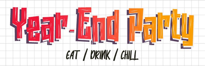
Event Title: The title, Year-End Party, was the centerpiece of the design. I used bold, playful typography with layered shadows to create depth and make it pop. The vibrant colors in the text mirrored the energy of the event while maintaining readability. The title’s size and position ensured it was the first thing viewers noticed, setting the tone for the entire poster.
Event Details: Information like the date, location, dress code, and ticket price was organized in a clean and structured way. Modern, sans-serif fonts ensured clarity, while a hierarchical layout guided the viewer’s eye naturally. Key details were emphasized using bold weights and vibrant colors to make them stand out.
Branding Elements: Kyrie Fitness Gym’s eagle logo was prominently placed to anchor the design. It served as a constant reminder of the gym’s identity and reinforced the connection between the event and the community. The textured background added a gritty feel, tying the design to the gym’s strength-focused branding.
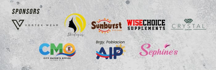
Sponsor Logos: Sponsor logos were neatly aligned at the bottom of the poster. Their placement ensured visibility without overshadowing the main event details. Subtle dividers helped separate them from the rest of the content, maintaining a clean overall look.
Visual Impact
The final color palette combined warm, energetic tones with cool, beach-inspired accents, creating a sense of balance between fitness and festivity. The textures added depth and movement, while the overall layout ensured that every element worked together seamlessly.
Lessons Learned
Every design project comes with lessons that shape your approach to future work, and the Kyrie Fitness Gym Year-End Party poster was no exception. This project reinforced the importance of balancing creativity with strategy, pushing boundaries while staying grounded in practicality.
Conclusion
The Kyrie Fitness Gym Year-End Party poster was more than just a design project—it was an exercise in blending creativity and strategy to capture the essence of an event. The final poster not only met the client’s goals but also resonated with the community it was created for. Every project like this is a reminder that great design isn’t just about aesthetics—it’s about storytelling, problem-solving, and connecting with people through visual impact.
Get in touch
Kick-start your digital presence with a stunning website and engaging visuals today. Find out how we can help you and book an introductory call